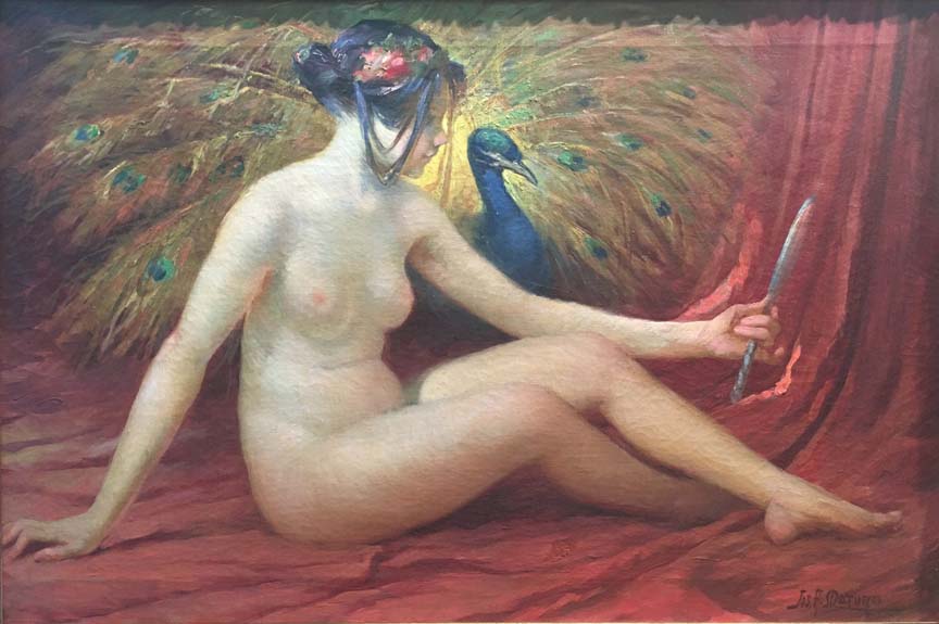
JOSEPH MATURO
"ODALISQUE WITH PEACOCK"
OIL ON CANVAS, SIGNED
AMERICAN, C.1900
22 X 28 INCHES
Joseph A. Maturo 1879-1938 Born in 1876 in Caserta, Italy, Joseph A. Maturo studied at the Naples Academy of Fine Art before immigrating to America in 1895. Joseph’s career path as an illustrator was anything but direct. As a matter of fact, he had planned to become an opera singer in America, but by 1903 that goal had disappeared, and he accepted a job as a teacher. His first long-term job related to art was as a copier for a catalogue art service called Douhitt Galleries, which offered low-cost made-to-order reproductions. With the development of color lithography in the late 1800s, many small businesses emerged to provide inexpensive art for the masses, including lithographers and publishers. These companies often used illustrators in one capacity or another. For Douhitt, Maturo painted copies of artworks that customers had ordered from the catalogue. Some were based on religious and mythological subjects of the old masters, while others were original scenes by Maturo, usually of bible stories. The canvases were not stretched onto wooden frames like most paintings; instead they were dubbed painted tapestries and intended to be hung from rods. At the time, Joseph used a studio located in the Lincoln Arcade at 1947 Broadway, near where Lincoln Center for the Performing Arts stands today. The building housed a sort-of artists’ colony inhabited by actors, singers, and fine artists. Later, after a stint as a designer of beaded dresses for flappers during the Jazz Age, Maturo became a magazine illustrator. He interpreted scenes in fictional stories published in such popular magazines as Liberty, Everybody’s, and St. Nicholas. He also illustrated for the cheap pulp weeklies that became popular in the 1920s and 30s, including Love Story, Detective Story, and Blue. In 1934, he was hired by Fox Film Corp.’s New York offices to design and create illustrations for movie posters, a job he retained after Fox merged with Twentieth Century. The job was not his only brush with the movies. From about 1916 to 1919, Joseph’s wife, Mira, who was a nurse, tended to members of Lillian Gish’s family. Originally hired by Lillian to take care of Dorothy, Mira also nursed Lillian either during the Spanish flu epidemic or after the actress became ill during the hazardous winter shoot for Way Down East. Mira was asked to travel with the Gishes but declined because Joseph’s work was based in New York. As partial payment for her services, the Gishes let Joseph and Mira use the apartment in back of their Manhattan home. By the time Joseph was designing posters for Fox, the Maturos had moved to Teaneck, New Jersey. Like most illustration, the goal of poster design is to interpret the subject so that it is immediately understood by the viewer. For movie posters, the subject includes what the movie is about and who is in it. During the Golden Age, when the industry was driven by the star system, these two elements were often one and the same. Viewers who saw a movie poster for a film starring Shirley Temple need only recognize Temple to have expectations of what the movie would be like. Thus, getting the likeness and essence of the stars in an illustration was essential to the poster. It is a measure of Maturo’s talent that he designed the posters for the Shirley Temple vehicles, beginning with Curly Top. He perfectly captured Temple’s round, dimpled features and sparkling star image. Before Joseph, Fox had gone through several illustrators for the Temple posters, but they had not been pleased with the results. Maturo’s illustrations were oil paintings translated into lithographs. The photo-lithographic process lost some of the detail of the oil paintings, flattening the images a bit. Colors also tended to be brighter in the posters than in the original paintings. Generally, Joseph painted more than one illustration for each film, because promotional material came in different sizes and formats. Poster sizes ranged in size from the standard one-sheet, which is 41 inches by 27 inches, to billboard size, which is 108 inches by 246 inches. Sizes were based on multiples of the 41 x 24 one sheet: A three-sheet is the size of three standard posters, while the billboard size is also called a 24-sheet. The 24-sheets were mounted by outside companies that specialized in handling billboards, including hand lettering the titles. There were also specialty sizes, such as subways (54 x 41), door panels (60 x 20), and inserts (36 x 14). Many of these sizes are still standard today. However, during the Golden Age, a theater owner had many other options. Lobby cards (11 x 14) were issued in sets of eight, with one of the cards reserved for titles. For important releases, jumbo lobby cards on high-quality card stock (14 x 17) were available, but this size was discontinued at the beginning of WWII. A theater owner or manager might opt for window cards (22 x 14) to pass along to local store owners who would put them in their windows, or midget window cards (14 x 8) for a store’s showcases. Press kits were sent to theater owners and managers, which featured publicity articles about the films, ready-made ads for newspapers, suggestions for local publicity stunts, and photos of the different sized posters available for that title. Theater owners rented the posters from the distribution exchanges. During the Depression, a one-sheet rented for about 15 cents, and a billboard for about $2.50. At the end of the film’s run, owners and managers were supposed to return the posters to the exchange, or, if the theater were located in a small town or rural area, they were asked to send the posters by bus to the next town, along with the film. Posters were repeatedly put up, taken down, and generally handled as the film traveled from venue to venue, so few made it through the initial run of a film intact. Those that did survive extensive use, poor storage, and accidents became creased, tattered, and torn. If it weren’t for theater employees who occasionally held back posters for favorite films or beloved stars, few posters would exist today. Today, posters of the classic films of the Golden Age make for pricey collectables. Like other movie-poster artists, Maturo was given some direction from Twentieth Century Fox’s publicity department. He received film stills from the movie to base his illustrations on, plus direction on which stars’ heads were to be posed together and what color to use for their hair. Studios were particular about which stars should be presented in full face, three-quarter view, or profile. There were also guidelines regarding head size. The large heads necessary for billboards were difficult, because it is hard to maintain a realistic expression when heads are larger than life size. Titles and names were also dictated by the studio, because some stars had top billing over others. All lettering was added to the painting by the studio art department before the paint was sent to the lithographers. Lettering was painted in gouache directly onto the painting, or on acetate laid over the painting, or on colored cardboard pasted onto the painting. Maturo’s first assignment for Fox was to design a poster for Ginger, a vehicle for nine-year-old Jane Withers. He created his last posters in 1938, the year that he died. In the four years that he was employed by Twentieth Century Fox, Joseph created posters for over 90 films. Among his most creative efforts were those that recreated complex scenes from the film as part of the overall composition. The poster for Café Metropole, which takes place in Paris, includes vignettes of the Eiffel Tower and Parisian night life under the main image of the three stars, Loretta Young, Tyrone Power, and Adolphe Menjou. My favorite paintings were those done for John Ford’s The Prisoner of Shark Island, starring Warner Baxter as Dr. Samuel Mudd, the doctor who was imprisoned for setting John Wilkes Booth’s leg. Baxter’s expression as he looks upward to a heaven that seemed to have forsaken him is heart-wrenching, while the detailed depiction of his life as a prisoner explains the pain on his face. Other films that Maturo created posters for included In Old Kentucky and Steamboat ‘Round the Bend starring Will Rogers, Charlie Chan’s Secret, the remake of Seventh Heaven starring Jimmie Stewart, and Thin Ice, a vehicle for Sonja Henie. I was charmed to learn that Joseph was as much a movie fan as those he lured into the theaters with his posters. He and Mira went to see all the movies that he created paintings for, and they were particularly fond of Shirley Temple. If you look carefully at the paintings for Temple’s films, it shows!
|